Saturday, November 05, 2005
Comic Art
 We finish up our tour of the Honorable Mentions this week with a look at Neal Adams. Adams is another one of those guys that has been around nearly forever. So much of his work was a part of my growing up and he made a huge impact.
He is still active today as you can see with this marvelous (yes, that was intended to be a publisher pun) rendering of The Mighty Thor. Thor remains in my mind one of the most visually dramatic (along with Captain American and Batman) of the comic heroes ever designed. He is after all a "god" and somehow he just looks the part.
I also love the way the platform Adams has put him on here ties in with Thor's apparel, it is as if they are one. Reminiscent indeed of Thor's original designer (and his look has never really been improved upon) Jack Kirby.
 Here's another Adams marvel image -- this one of the Avengers. I really like the way he has put Antman and Hawkeye in the foreground in this image. Images of the Avengers tend to feature "the big three" - Cap, Iron Man, Thor - but it is really the other characters that make the title great.
I also have to say that Antman is one of the most visually interesting characters ever. Originally Hank Pym (whom you see in this picture in his Yellowjacket costume in the rear) the role has since been filled by Scott Lang -- a fascinating character, single dad, journeyman electrician, who got into the hero game under unusual circumstances. I really want the guy to get his own title.
What can be said about Hawkeye? His look has become a little dated, but what a great image.
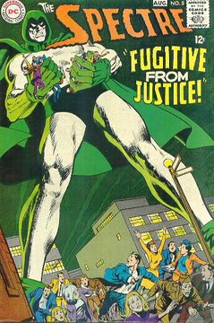 Regular readers know my fondness for the Spectre. As a character he has come and gone, but as an image, just check him out. Adams, as you can see did him quite well.
It's never easy to know how to draw this character, part ghost, powerful as a God, does one draw him as mist or as massive. Well, Adams approach is obvious and I think it really works. Some find the character boring because he is so powerful that there is never any genuine conflict. That may make him hard to write for, but it open up visual possibilities that few characters can enjoy.
I think we are awaiting just the right mating of writer and artist to have the Spectre sore into the atmosphere. I would not be at all disappointed if Adams was the artist. This character needs to move onto the cosmic level somehow. I think there would be a great story if he actually attempted to set himself up as a God. Maybe a Marvel/DC cross-over where he battles the Living Universe or something like that. It would be serious eye candy.
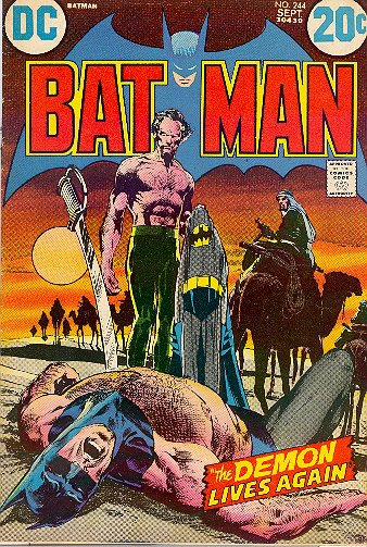 Adams put the tall ears on the Bat, and while they look a little goofy on the blue and gray, they are the order of the day when Batman dawns his black.
Adams is also notable for putting Ras a Ghul (bad guy in the latest film by the way) on the map as Batman's opponent. Ras is the "anti-Joker" - all the cunning and hyper-rational to boot.
Note this dates back a ways - late '70's early '80's - that's how long Adams has been in the game and making an impact.
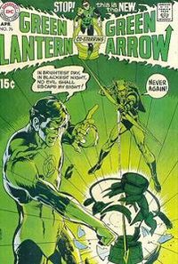 But far and away, his most "important" work was the GL/GA series. Pairing the conservative Green Lantern with the near-hippie Green Arrow proved to be the start of social commentary in comics. I did not always agree with the political conclusions arrived at in these books, in fact I usually didn't, but the idea was incredible.
These books were a large part of changing the comic audience. They were decidedly for someone a little older than 12, they were accessible by women, and they sold well. In my opinion they mark the beginning of the "adultification" of comics. A tend that has continued to this day. To the point where the publishers are having to make concerted efforts to groom another generation as an audience.
And it started with Neal Adams.
![]()


