Saturday, October 15, 2011
Comic Art
SO BAD, THEY'RE GOOD

 "Never get a good look go" - I think it is an axiom in comics. Especially when you are in the "x-world" of comics where characters have proliferated to the point powers are replicated left and right and measured on scales so our primary characters can remain primary even when there are a couple dozen other mutants out there with the same capabilities.
When the X-crew hit upon Colossus, they hit hero-look gold. The metal skin, the black flat-top haircut is just a winner. I fell in love with that look (though the character needed significant work) the first time I ever saw it - which believe me was a long time ago.
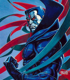
So, it is unsurprising that the look would show up in a baddie - Mr. Sinister.
 So much does Sinister look like Colossus that the first time I ever saw Sinister (on a cover) I thought we had a story of Colossus gone bad. As I said, Colossus needed work, so that would have been a welcome story turn, but no, same-look/new character.
In more recent artwork, influenced perhaps by the prevalence of a TV entry to the character (cartoons can't do metal well) or perhaps to avoid the confusion with Colossus, the Sinister character has gone white face, ala the Joker in stead of metallic - crying shame.
Oh yeah, and while we are talking derivative, those "not a cape" things hanging off his shoulders are highly derivative. I think rooted originally in an obscure (but Lordy I love him) DC character - The Creeper. The are also evocative of the metallic wings Angel sprouted in the Apocalypse saga in X-world.
For such a derivative look, it is amazing Sinister has hung around as long as he has - or is it?


 "Never get a good look go" - I think it is an axiom in comics. Especially when you are in the "x-world" of comics where characters have proliferated to the point powers are replicated left and right and measured on scales so our primary characters can remain primary even when there are a couple dozen other mutants out there with the same capabilities.
When the X-crew hit upon Colossus, they hit hero-look gold. The metal skin, the black flat-top haircut is just a winner. I fell in love with that look (though the character needed significant work) the first time I ever saw it - which believe me was a long time ago.
So, it is unsurprising that the look would show up in a baddie - Mr. Sinister.
So much does Sinister look like Colossus that the first time I ever saw Sinister (on a cover) I thought we had a story of Colossus gone bad. As I said, Colossus needed work, so that would have been a welcome story turn, but no, same-look/new character.In more recent artwork, influenced perhaps by the prevalence of a TV entry to the character (cartoons can't do metal well) or perhaps to avoid the confusion with Colossus, the Sinister character has gone white face, ala the Joker in stead of metallic - crying shame.
Oh yeah, and while we are talking derivative, those "not a cape" things hanging off his shoulders are highly derivative. I think rooted originally in an obscure (but Lordy I love him) DC character - The Creeper. The are also evocative of the metallic wings Angel sprouted in the Apocalypse saga in X-world.
For such a derivative look, it is amazing Sinister has hung around as long as he has - or is it?

Technorati Tags:comics, comic art, comic books, villains, mr sinister
Generated By Technorati Tag Generator
![]()


